Simplifying Learning Journeys: Redesigning COGNIGIX’s LMS to Empower Users with Intuitive Course Creation
COGNIGIX platform and services focus on creating engaging and effective learning journeys that address specific business and people challenges, combining traditional learning methods with modern digital technologies

Not interested in my design process? No worries at all.
Skip to final product
Type
Learning Management System
Team
PM, 2 Designers, 1 Business Analyst
Role
UX/UI Designer
Platform
Desktop
Responsibility
Design Vision
Tools
Figma
Timeline & Completion
(3 Months) April 2022


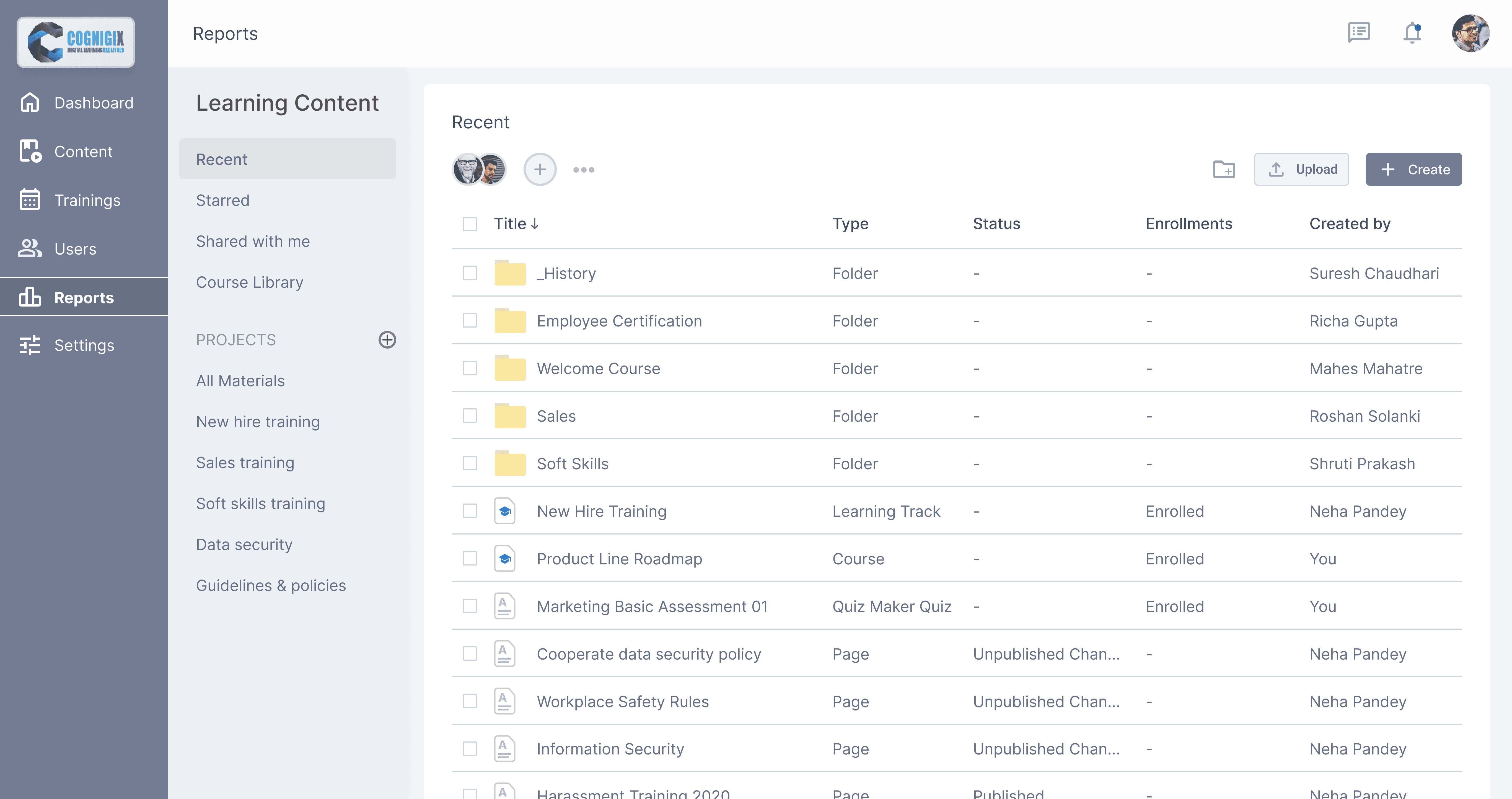
Operations seeks time-saving solutions for onboarding, course creation, and material management.
Learners value responsive platforms that are easy to navigate and incorporate feedback.


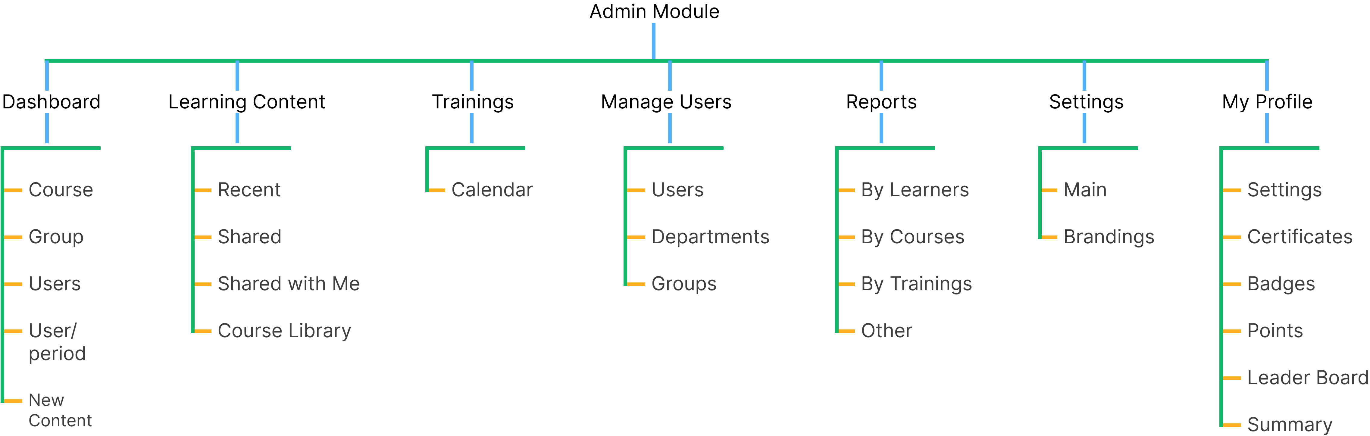
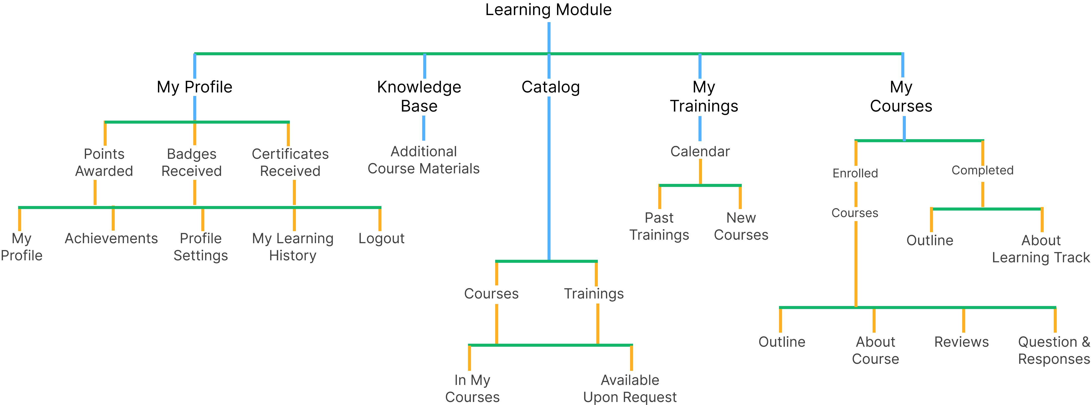
Administrator
Instructors
Learners

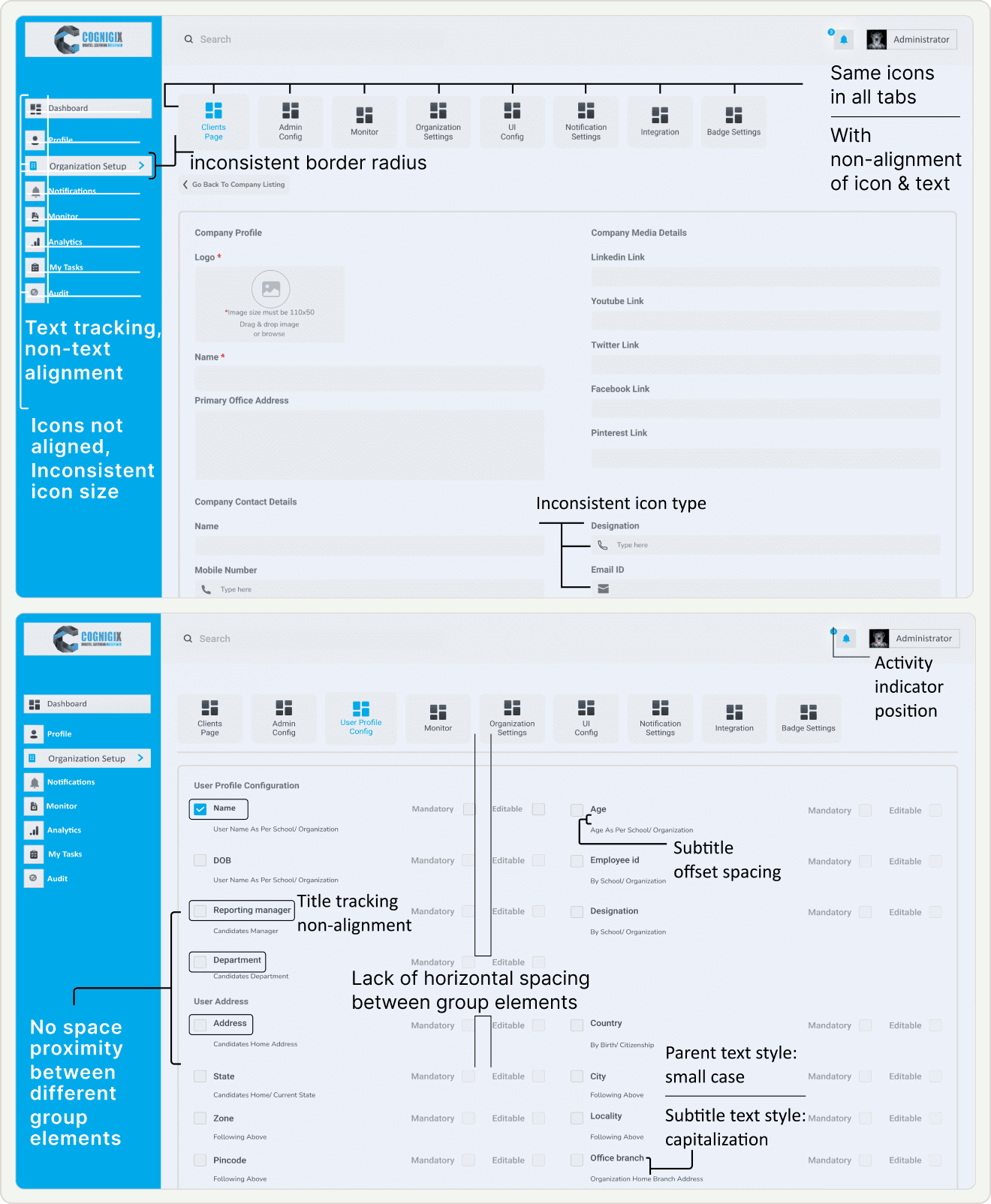
Font Inconsistency
Lack Guidance and Hierarchy: Titles associated with each section fail to provide the necessary guidance and hierarchy.
Offset Spacing: Subtitles within the sections exhibit offset spacing issues, resulting in a misalignment with the associated content.
Inconsistent Case: Parent text, in small case, is inconsistent with the title case subtitles, creating a jarring visual contrast.
Navigation Challenges
Tab and Icon Navigation: Similarity in tab structure & icons leads users struggled with the page navigation.
Incomplete naming terminology: of page menu system had made it hard for users to understand and predict the content.
Input-UI Misalignment Issue: Non Alignment of UI layout and interaction patterns with the expected input types.
Information Hierarchy
Decision Fatigue Navigation: Course creation, where the side navigation gives multiple options to go with like course, program, content, topics, etc. by default it must be not-collapse.
Decision Fatigue Form: The form list every data required for course creation that is overwhelming and time consuming. here there are many things that are not necessary to fill right now it can be easily filled out latter, so there is no prioritization of needed input right now & fill rest later to make course creation friction less.
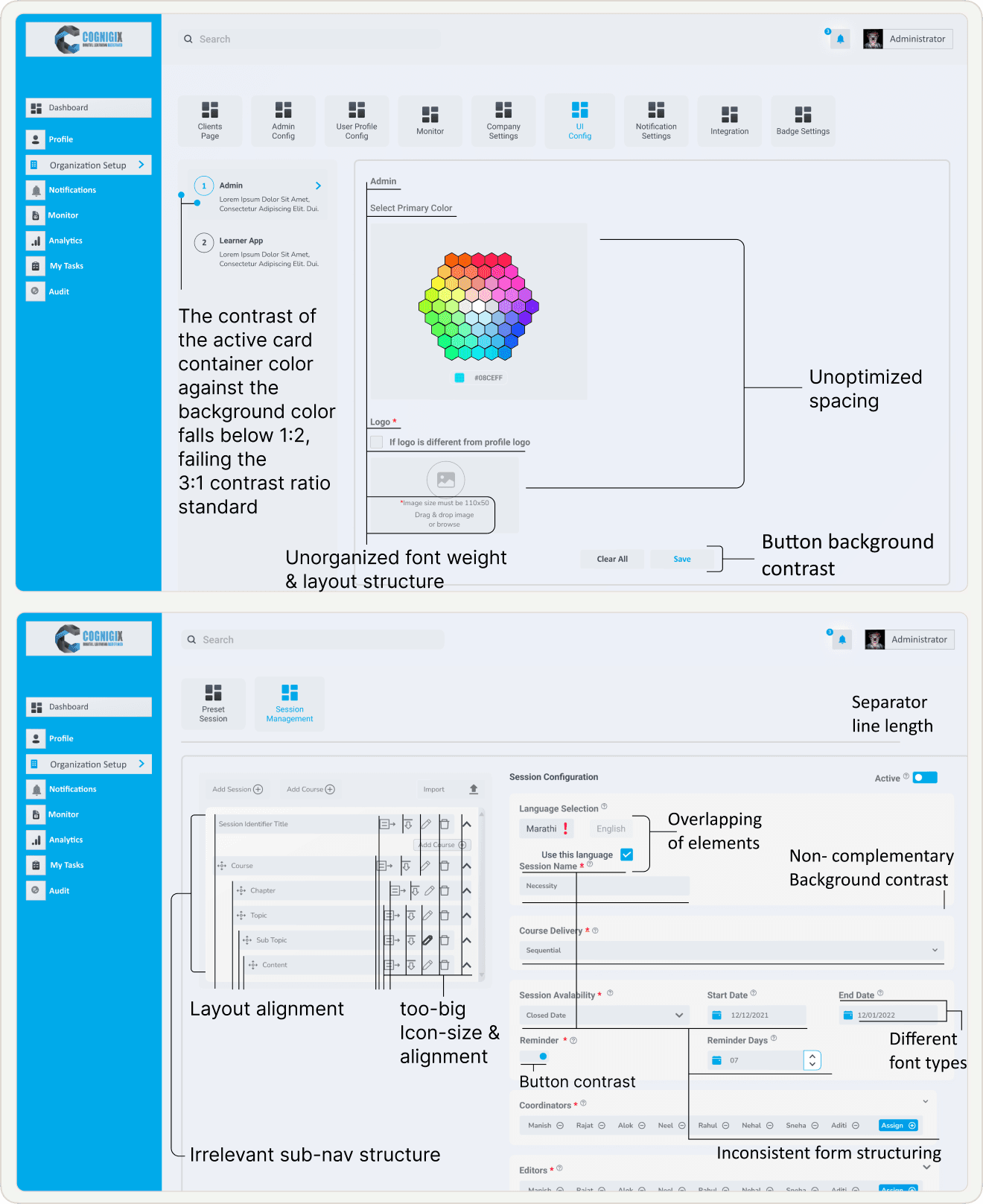
Layout and Icon Inconsistency:
Low Contrast: Buttons on the interface suffer from inadequate background contrast.
Accessibility Concern: Low contrast between the button background and the text can make it difficult for users, especially those with visual impairments, to identify and interact with these critical interface elements.
UI Misalignment: Suboptimal spacing throughout the interface, affecting both visual aesthetics and user experience.
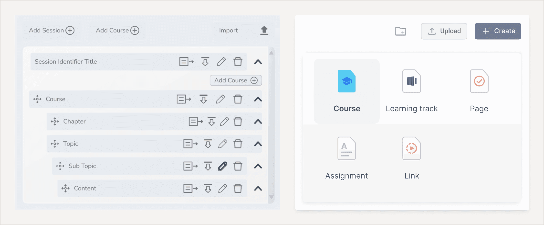
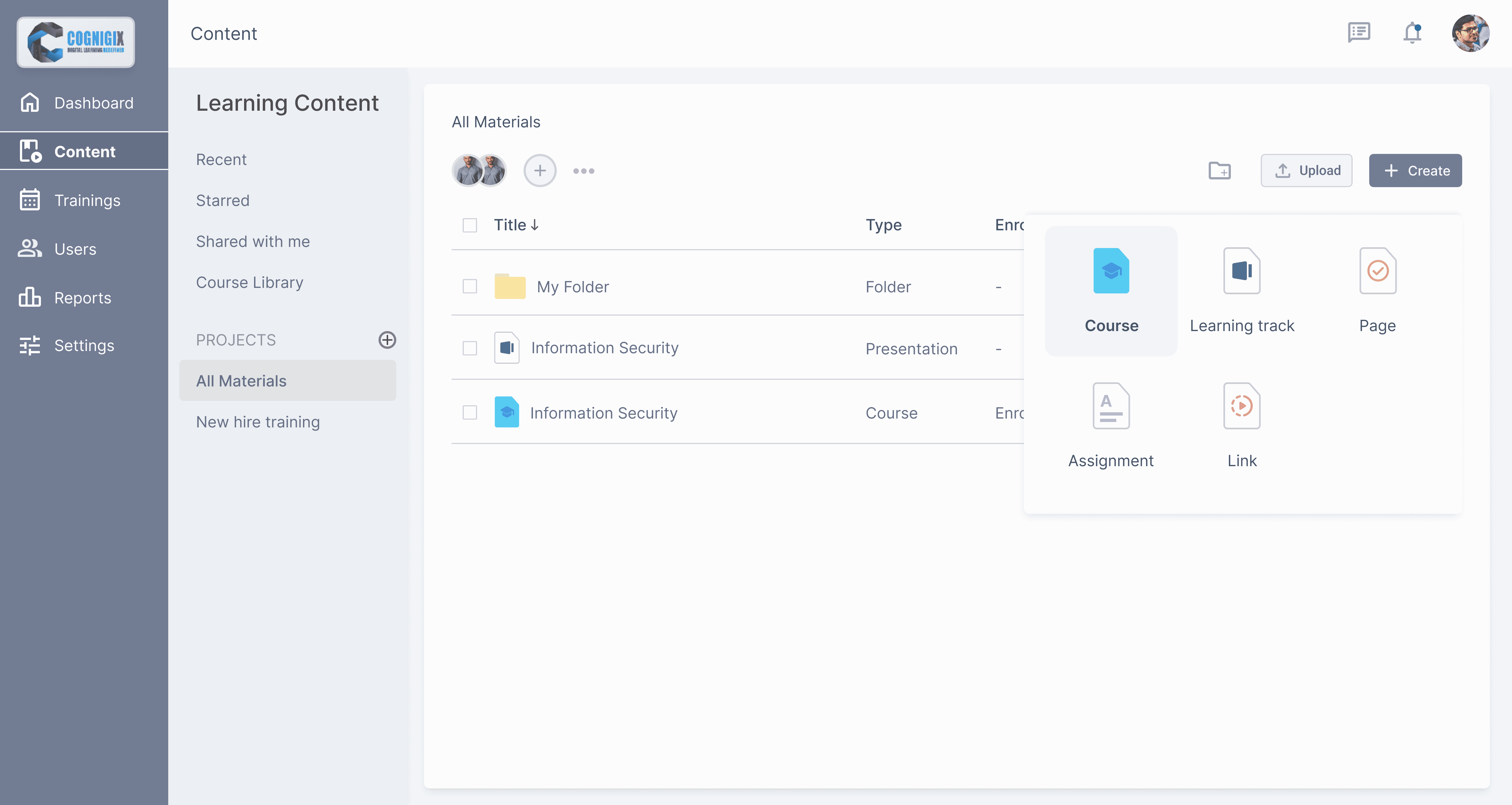
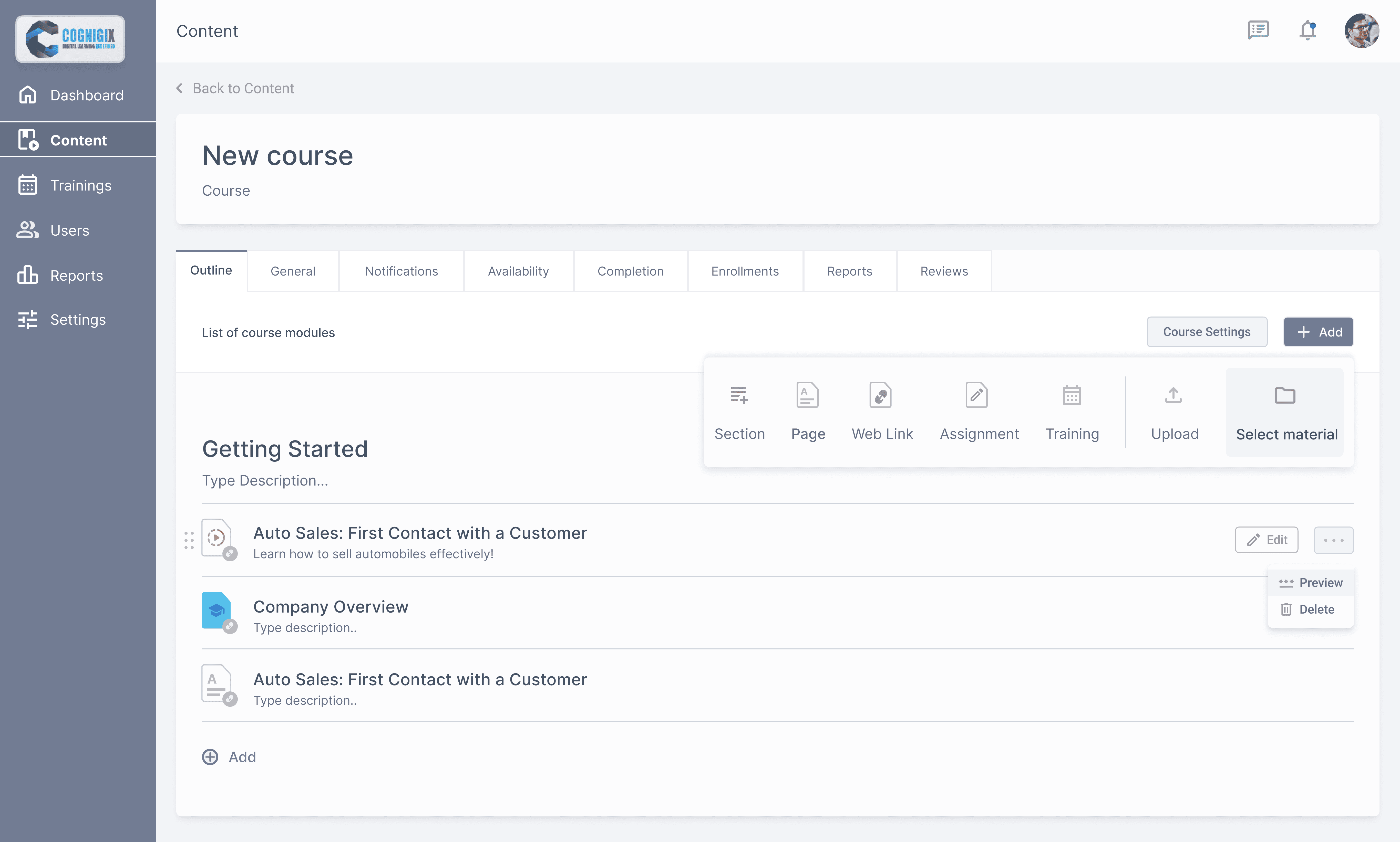
Creating Course & Uploading Content
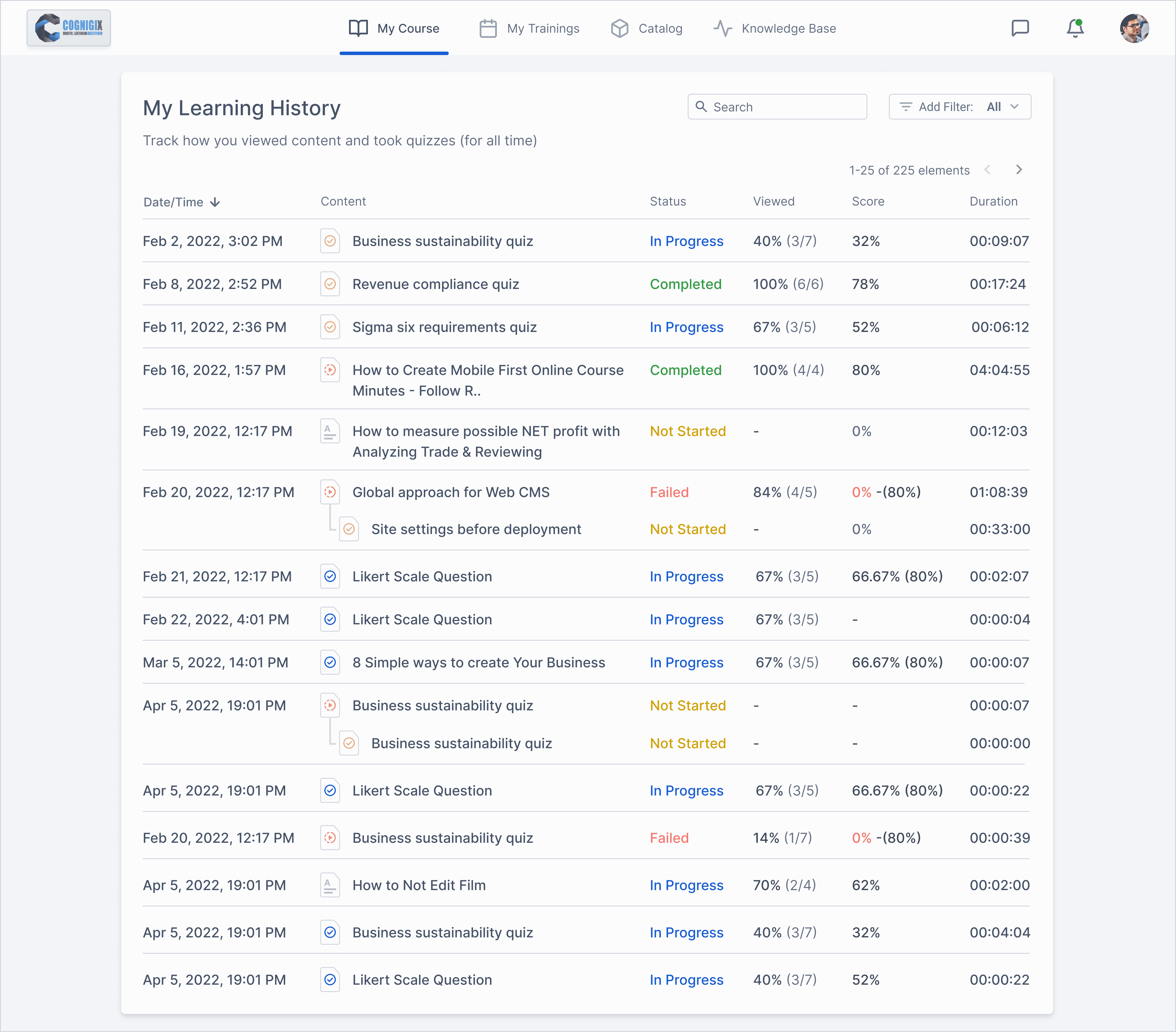
Monitoring learners progress
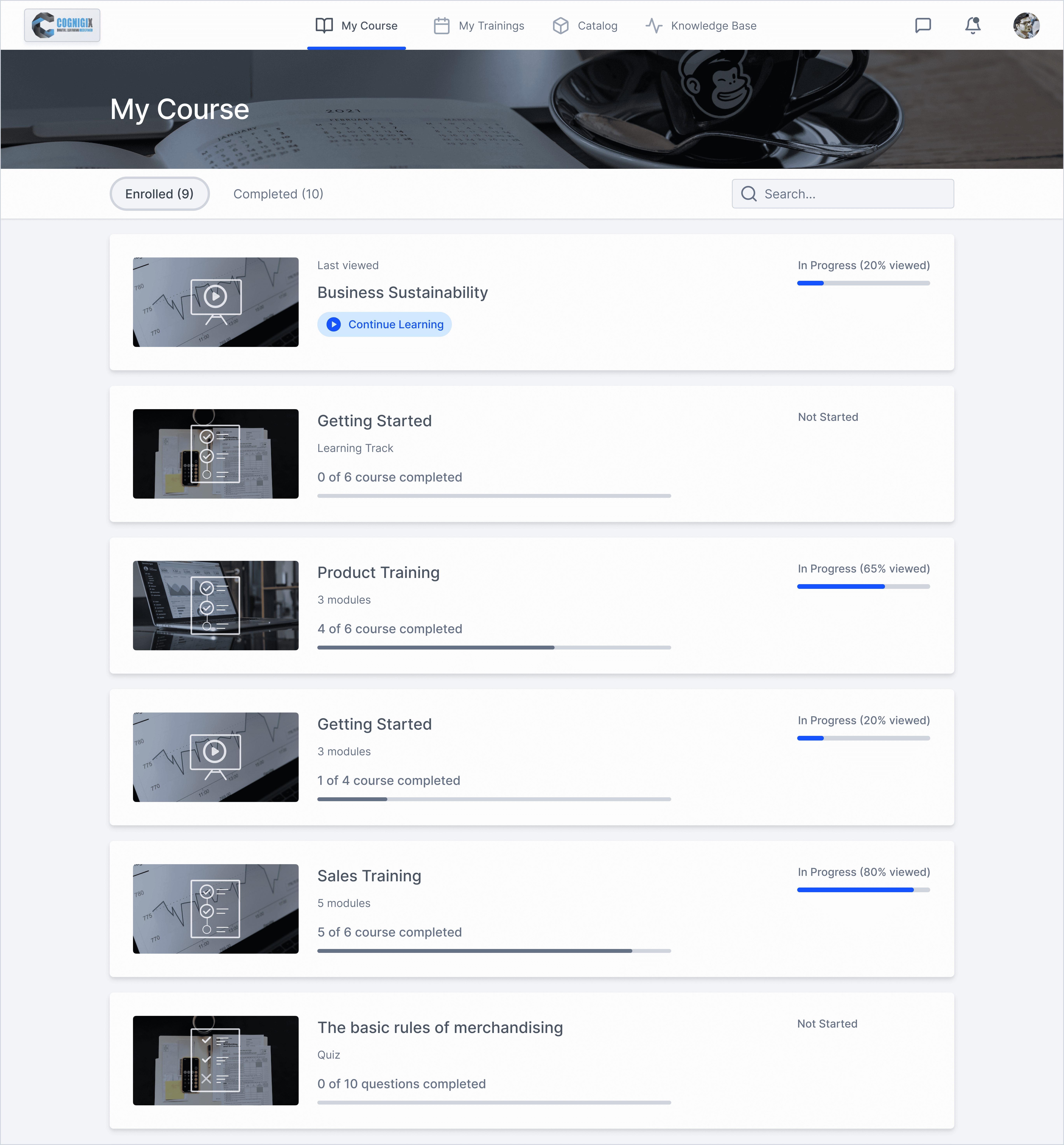
Learners tracking their course status
Accessible Course home page
Primary action items:
1. Learning Item Name button generates a new Learner Results report on the same page. This represents the progress of a specific user.