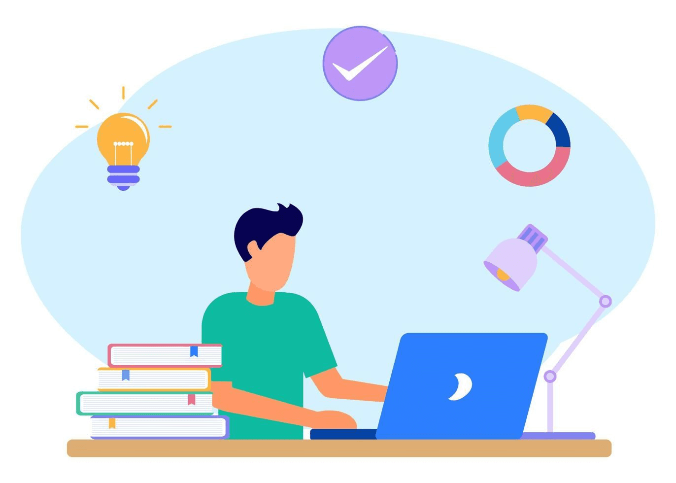
The redesign journey of LMS
The journey of digital journey from legacy system to modern LMS.

Cognigix is an innovative Learning Management System (LMS) web application that aims to revolutionize the way users engage with online learning. We are committed to providing modern, user-friendly tools and resources for educators and learners worldwide. Our goal is to transform the traditional learning experience into an interactive and personalized journey, accessible anytime, anywhere.
Through a combination of cutting-edge technology and user-centric design, we strive to empower educators and learners to unlock their full potential. With a focus on creativity and collaboration, we continuously iterate and improve our platform to meet the evolving needs of the education community.
Type
Learning Management System
Role
UX/UI Design
Responsibility
Design Vision
Timeline & Completion
(3 Months) April 2022
Team
PM, 2 Designers, 1 Business Analyst
Platform
Desktop
Tools
Figma
Challenge
Challenge
What we needed to redefine
What we needed to redefine
We needed to build a strong new foundation for an old legacy. An entirely new look and feel was the goal. We wanted to design an experience that will cater to the growth of Cognigix. One of the key challenges was to reduce the user journey for the application process.
We needed to build a strong new foundation for an old legacy. An entirely new look and feel was the goal. We wanted to design an experience that will cater to the growth of Cognigix. One of the key challenges was to reduce the user journey for the application process.
Our Approach
Our Approach
Cognigix and Our Team
Cognigix and Our Team
Cognigix and our team collaboration culminated in a cutting-edge design that embodies modernity, excitement, and innovation. At the heart of this partnership were the users and the core values of the Cognigix brand. Our objective was to craft an experience that users would find enjoyable while preserving the essence of Cognigix's identity. Rather than reinventing the wheel, we sought to delve deep into the essence of Cognigix and seamlessly build upon its foundation.
Our strategy involved transcending the conventional boundaries of traditional learning platforms to introduce something fresh and intuitive. We aimed to offer users an experience that not only stood out but also seamlessly integrated into their learning journey.
Design Process
Design Process
Research
Research
Requirement gathering
Our understanding
Competitive analysis

Plan
Plan
Stakeholders interview
User interview
Information architecture
Ideations
Ideations
Design workshop
Wireframes
Moodboarding
Create
Create
UI design
Design system
Final UI
Prototyping
Interactions

Key Findings
Key Findings
User testing
Implementation
Research
Research
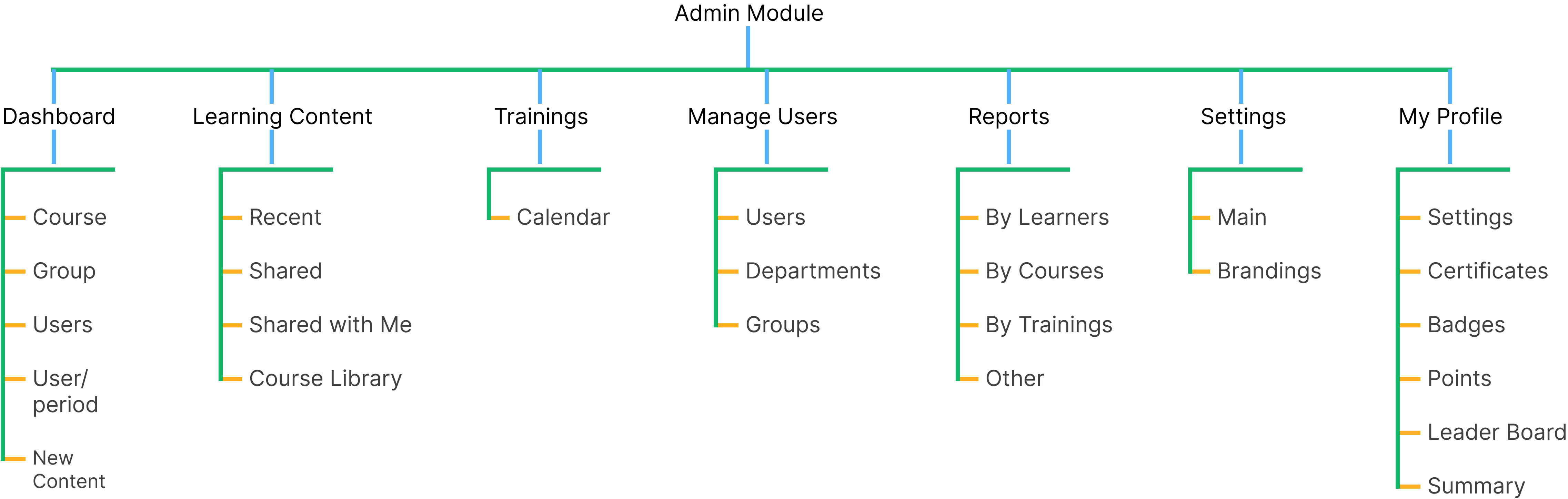
Admin & Learner Portal Design:
Admin & Learner Portal Design:
The client insisted on an easy-to-use, time-saving experience.
The client insisted on an easy-to-use, time-saving experience.
We drew inspiration for the data flow and layout from commonly used daily work services."
We drew inspiration for the data flow and layout from commonly used daily work services."


The learners data flow, layout are inspired from following services.
The learners data flow, layout are inspired from following services.


Personas
Personas
Educational, Industry professionals & Administrators
Educational, Industry professionals & Administrators
This user group typically includes university & industry administrators, teachers, and instructional designers who are responsible for managing and delivering online courses meanwhile receiving the trainings for the same.
This user group typically includes university & industry administrators, teachers, and instructional designers who are responsible for managing and delivering online courses meanwhile receiving the trainings for the same.
Administrator
Manage users account, permission & configurations.
Manage users account, permission & configurations.
To assign roles, control access to different parts of the system.
To assign roles, control access to different parts of the system.
Instructors
Create & manage courses.
Create & manage courses.
Upload content.
Upload content.
Track learners progress.
Track learners progress.
Learners

Access and complete training courses.
Access and complete training courses.
Assessments & other learning materials.
Assessments & other learning materials.
Ideation
Ideation
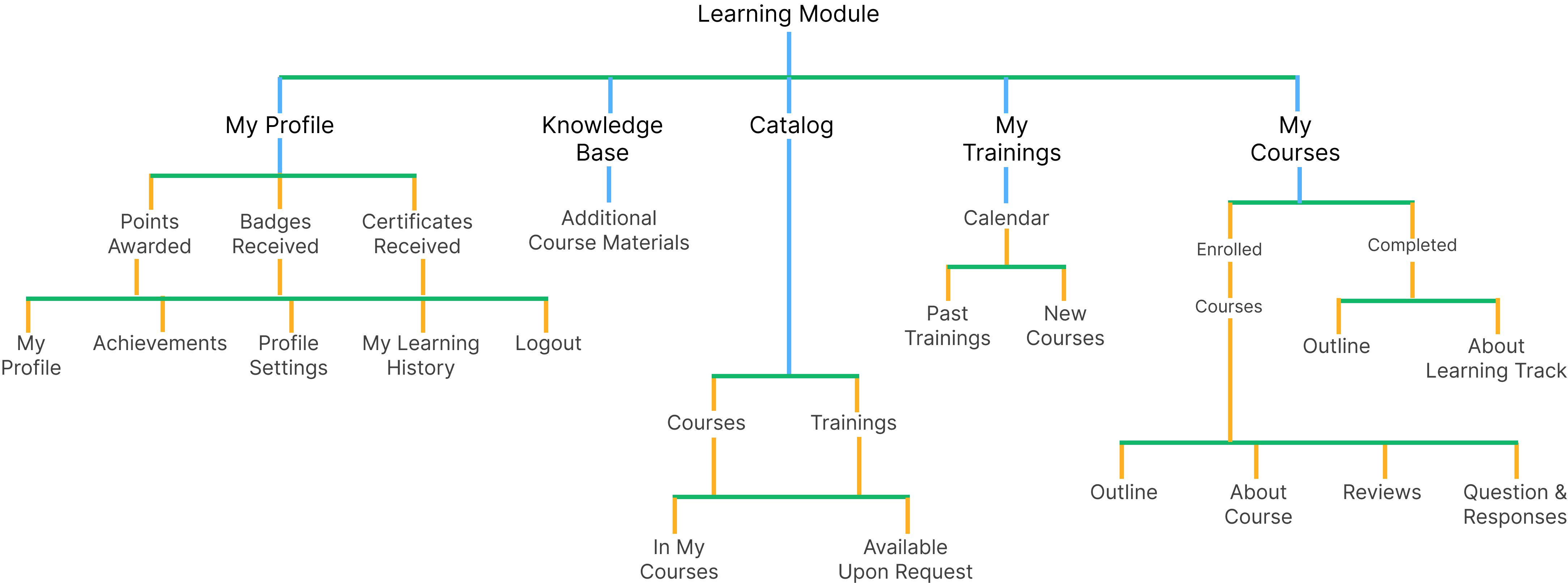
Logical User Flow
Logical User Flow
After streamlining the data-flow, re-structuring user flow became possible. It started with creating primary task first for Admin where primary work is manage content, permissions, users etc, the chronology starts with
After streamlining the data-flow, re-structuring user flow became possible. It started with creating primary task first for Admin where primary work is manage content, permissions, users etc, the chronology starts with
Creating content -> User enrollment -> Managing Permissions
Creating content -> User enrollment -> Managing Permissions
Same goes for Learners
My Courses -> Trainings -> Additional Courses & -> Profile
Same goes for Learners
My Courses -> Trainings -> Additional Courses & -> Profile
Prototype
Prototype
Information Architecture Audit: Admin Side
Information Architecture Audit: Admin Side
During the information architecture audit of LMS, several key issues were identified, these include:
During the information architecture audit of LMS, several key issues were identified, these include:
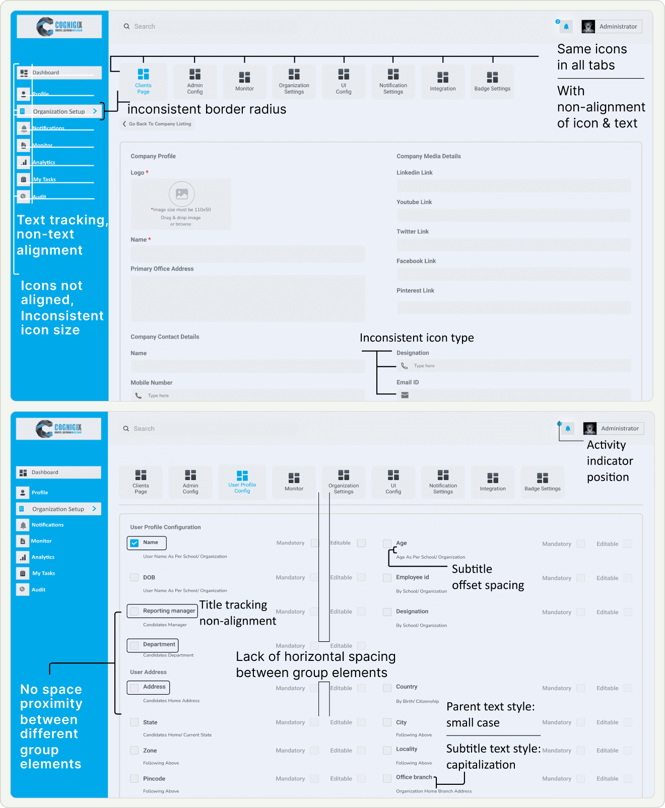
Font Inconsistency
Lack Guidance and Hierarchy: Titles associated with each section fail to provide the necessary guidance and hierarchy.
Offset Spacing: Subtitles within the sections exhibit offset spacing issues, resulting in a misalignment with the associated content.
Inconsistent Case: Parent text, in small case, is inconsistent with the title case subtitles, creating a jarring visual contrast.
Navigation Challenges
Tab and Icon Navigation: Similarity in tab structure & icons leads users struggled with the page navigation.
Incomplete naming terminology: of page menu system had made it hard for users to understand and predict the content.
Input-UI Misalignment Issue: Non Alignment of UI layout and interaction patterns with the expected input types.
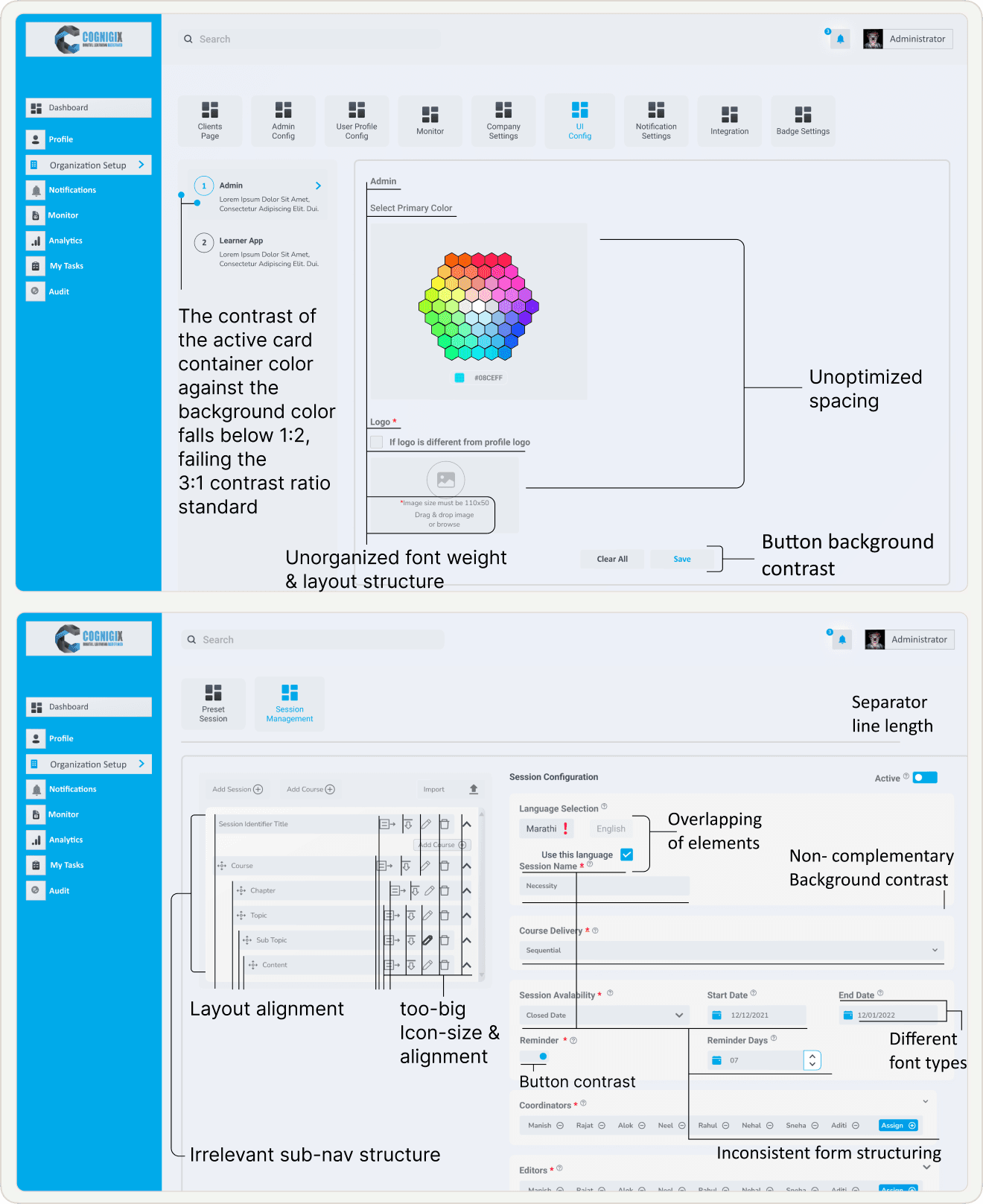
Information Hierarchy
Decision Fatigue Navigation: Course creation, where the side navigation gives multiple options to go with like course, program, content, topics, etc. by default it must be not-collapse.
Decision Fatigue Form: The form list every data required for course creation that is overwhelming and time consuming. here there are many things that are not necessary to fill right now it can be easily filled out latter, so there is no prioritization of needed input right now & fill rest later to make course creation friction less.
Layout and Icon Inconsistency:
Low Contrast: Buttons on the interface suffer from inadequate background contrast.
Accessibility Concern: Low contrast between the button background and the text can make it difficult for users, especially those with visual impairments, to identify and interact with these critical interface elements.
UI Misalignment: Suboptimal spacing throughout the interface, affecting both visual aesthetics and user experience.
Final Deliverable
Final Deliverable
We have worked on several designs but there are some that are simple yet important for the core on which the entire platform is build & later can be scaled.
We have worked on several designs but there are some that are simple yet important for the core on which the entire platform is build & later can be scaled.
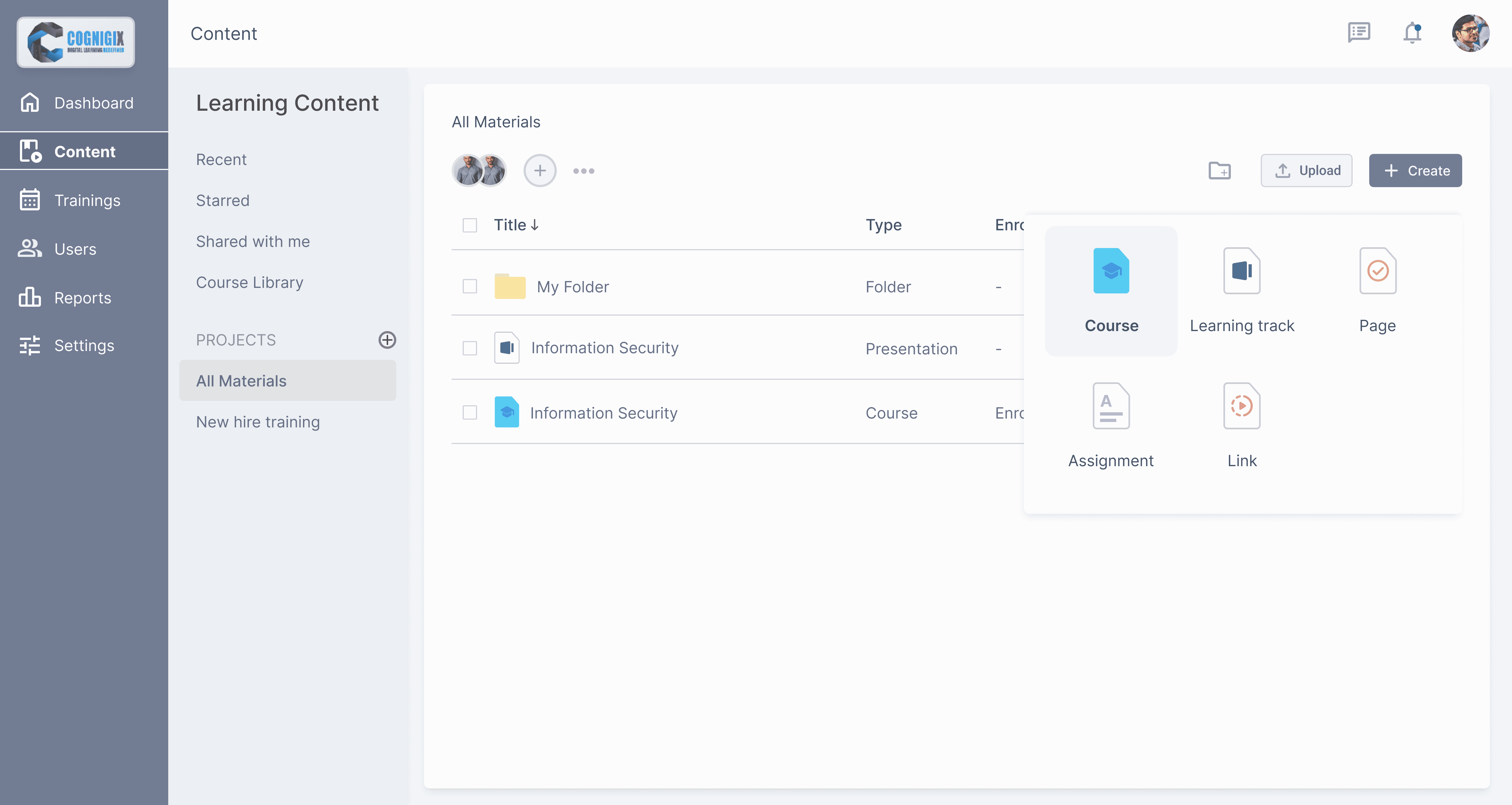
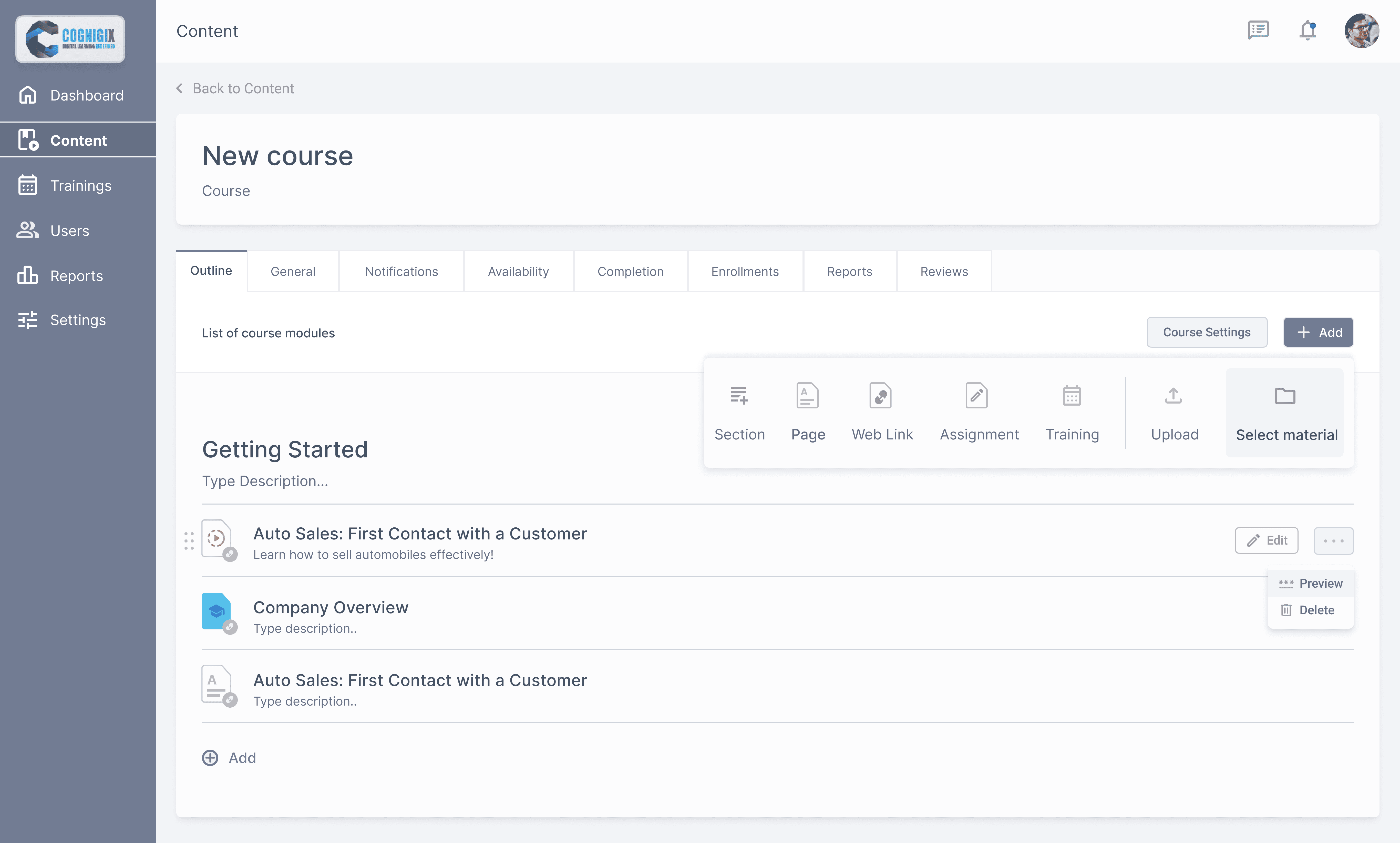
Creating Course & Uploading Content
Monitoring learners progress
Learners tracking their course status
Accessible Course home page
The Creation
The Creation
The process of uploading content is similar to working with file-sharing services like Google Drive or Dropbox. Shifting from "form filling" approach to traditional "File Manager" approach from desktop environments.
The process of uploading content is similar to working with file-sharing services like Google Drive or Dropbox. Shifting from "form filling" approach to traditional "File Manager" approach from desktop environments.
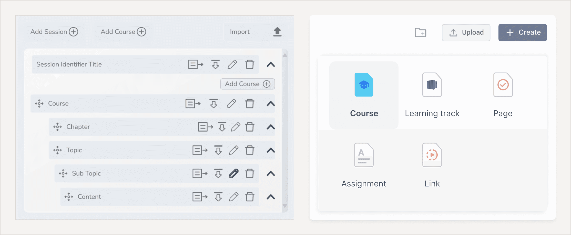
Clicking on the “Upload File” button and select the files from your computer. "Creating Folders" to segregate content based on their type. "Selecting Materials" from content repository to destination folder.
Clicking on the “Upload File” button and select the files from your computer. "Creating Folders" to segregate content based on their type. "Selecting Materials" from content repository to destination folder.
Action Items
Action Items
Components are formed by properties that can, and cannot be changed when using them in code. For example, a dialog can have a title, a body text, and an action button with text values that will change depending on the occasion. Everything else (background color, margins and separations) will invariable remain the same.
Components are formed by properties that can, and cannot be changed when using them in code. For example, a dialog can have a title, a body text, and an action button with text values that will change depending on the occasion. Everything else (background color, margins and separations) will invariable remain the same.
Every actions items have their own set of settings, starting from Selecting Material
Every actions items have their own set of settings, starting from Selecting Material
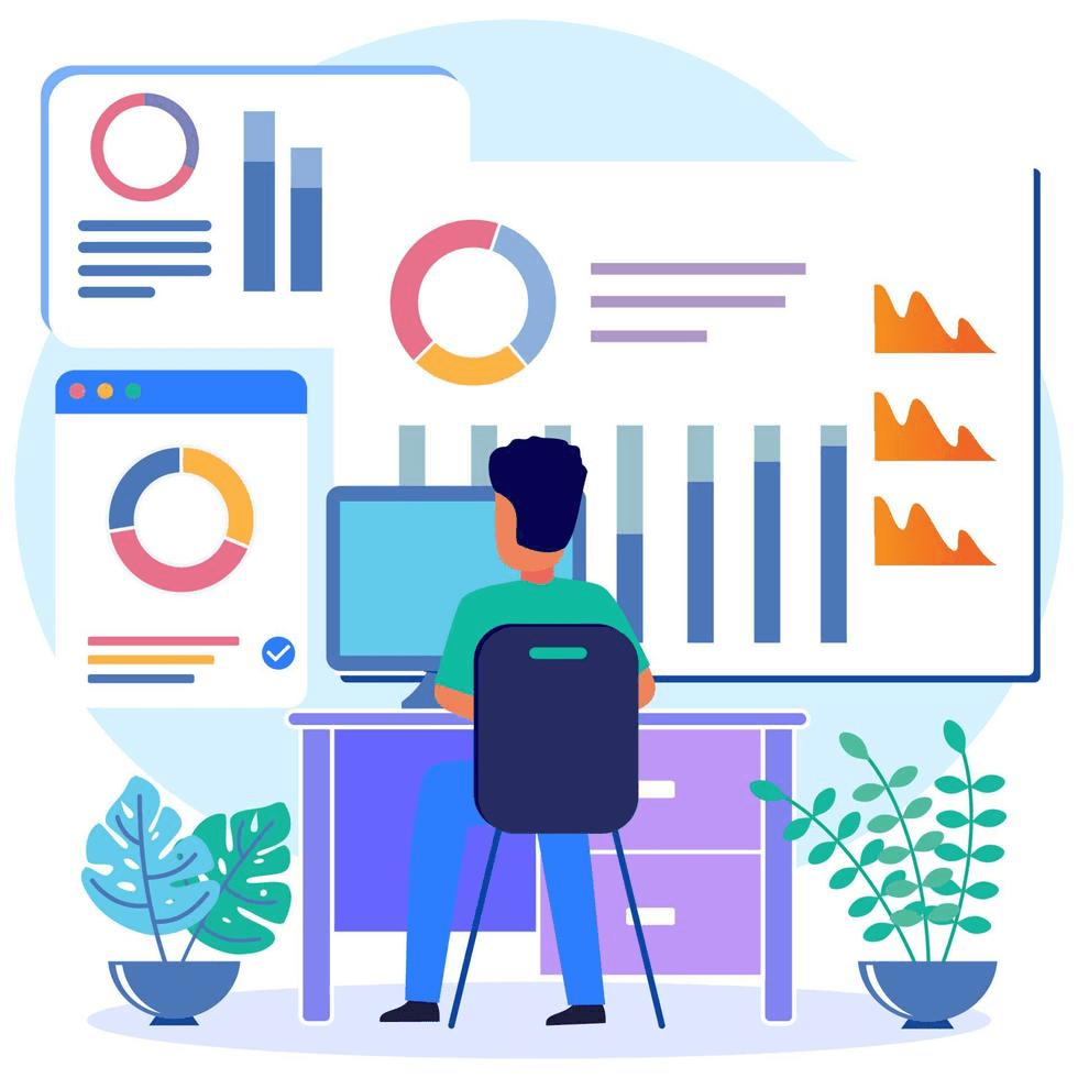
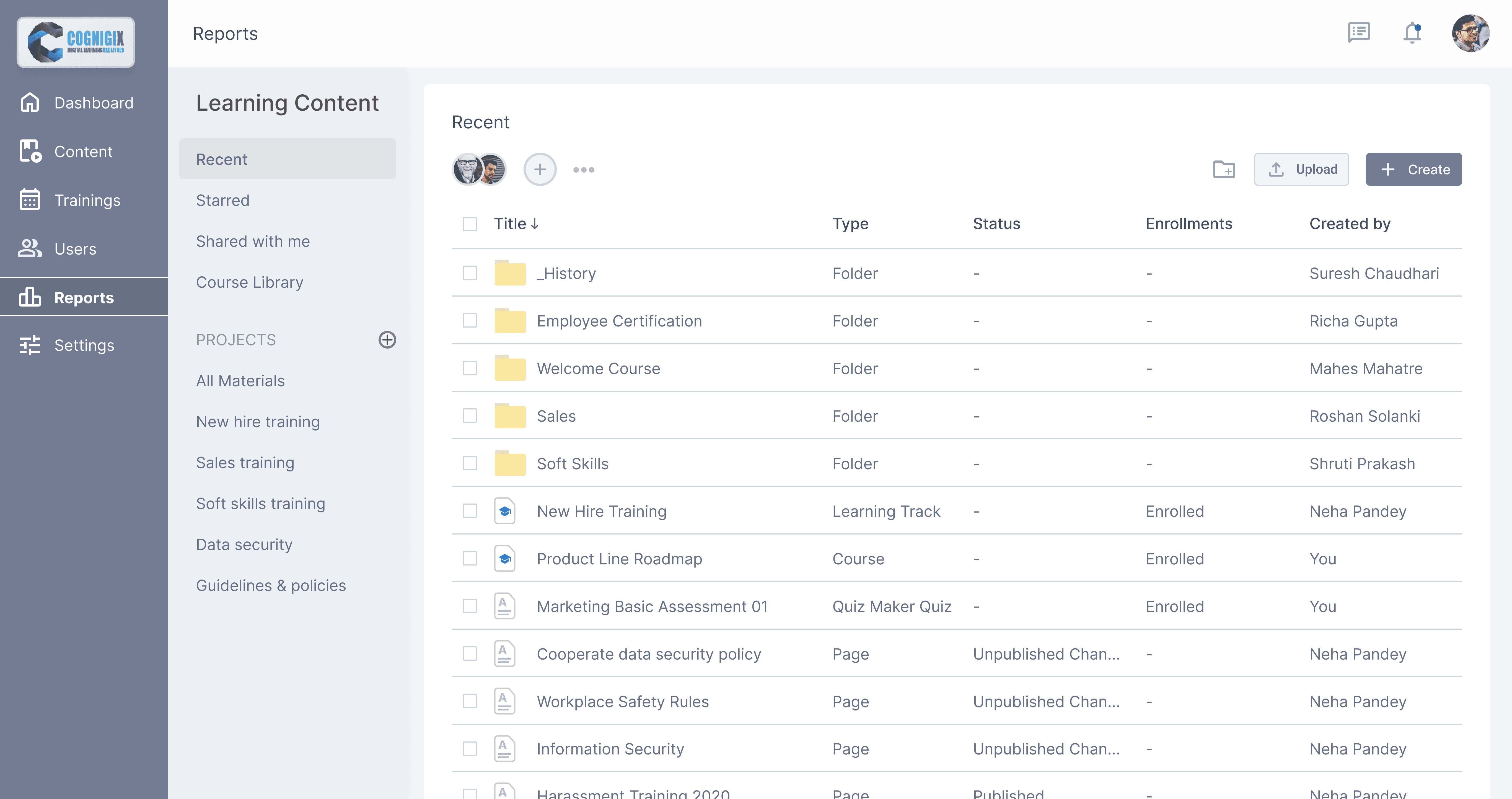
Monitor your learner & team productivity
Monitor your learner & team productivity
A summary of the entire report will appear above the table with the results.
A summary of the entire report will appear above the table with the results.
Filter action items:
Enrollment type filter to view report on materials by Administrator & Catalog.
Filter action items:
Enrollment type filter to view report on materials by Administrator & Catalog.
Learning Item Name filter you select a course/a training with no users enrolled.
Learning Item Name filter you select a course/a training with no users enrolled.
Primary action items:
1. Learning Item Name button generates a new Learner Results report on the same page. This represents the progress of a specific user.
Track by different type of elements, by clicking on one of these elements admin can see detailed reports of learners. To save time & improve usability admin can also generates reports from content sections selecting reports section within course & selecting learners & report type.
Track by different type of elements, by clicking on one of these elements admin can see detailed reports of learners. To save time & improve usability admin can also generates reports from content sections selecting reports section within course & selecting learners & report type.
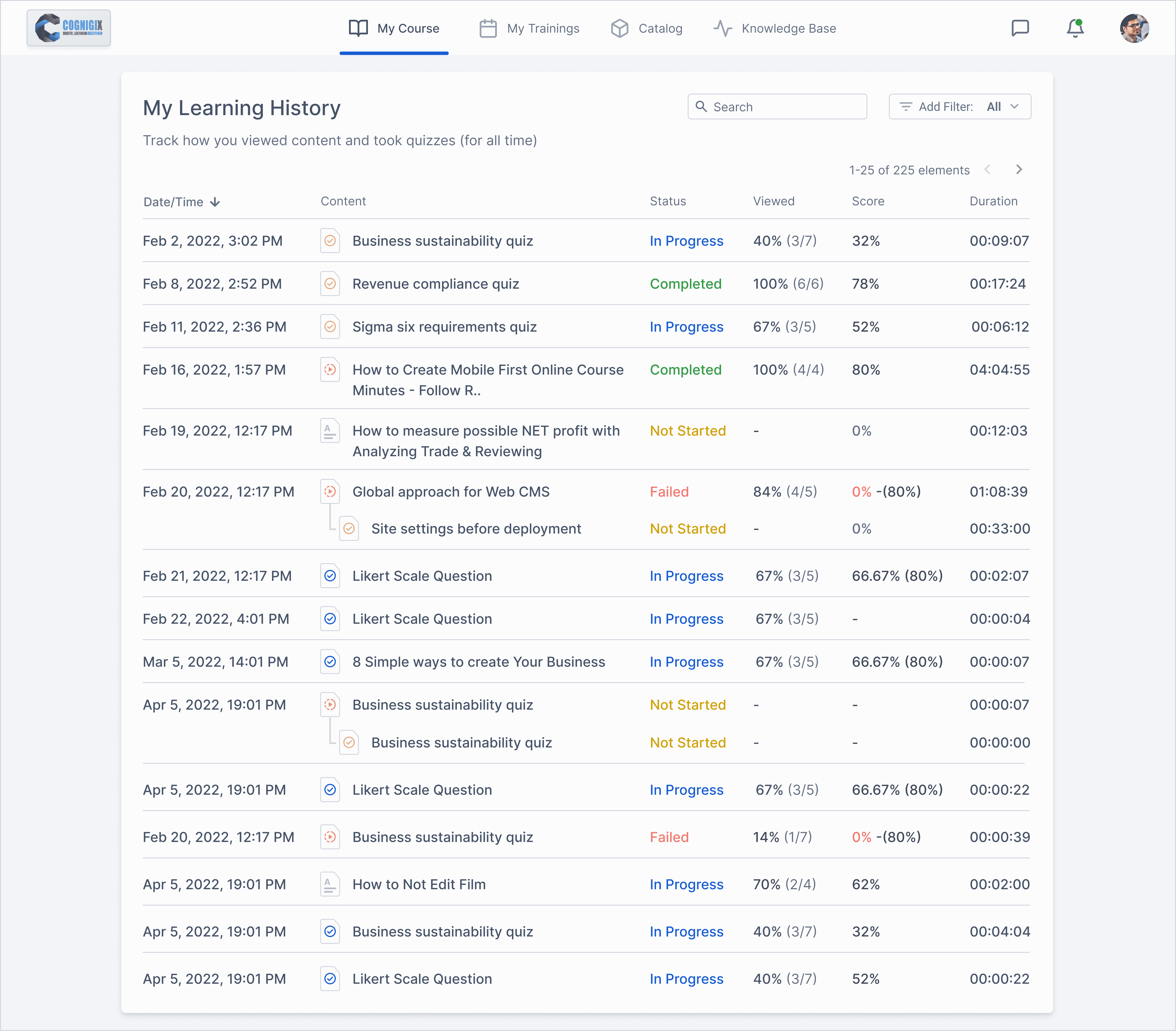
Learning History
Learning History
In the My Training History section, learners can view how they were progressing through the courses. The history can be sorted by the following parameters:
In the My Training History section, learners can view how they were progressing through the courses. The history can be sorted by the following parameters:
• Date/Time
• Date/Time
• Content title
• Content title
• Status
• Status
• View percentage
• View percentage
• Score
• Score
• Duration
• Duration
Learning History consist of content view status along with score & duration.
Used table format to represent data.
Used different color codes to represent course journey status.
Used different icons to represent content types as: Quiz, Text, Video etc.
Learning History consist of content view status along with score & duration.
Used table format to represent data.
Used different color codes to represent course journey status.
Used different icons to represent content types as: Quiz, Text, Video etc.
This 4 variables have 2 states either fixed or flexible ex: fixed time, flexible duration vice-versa.
This 4 variables have 2 states either fixed or flexible ex: fixed time, flexible duration vice-versa.
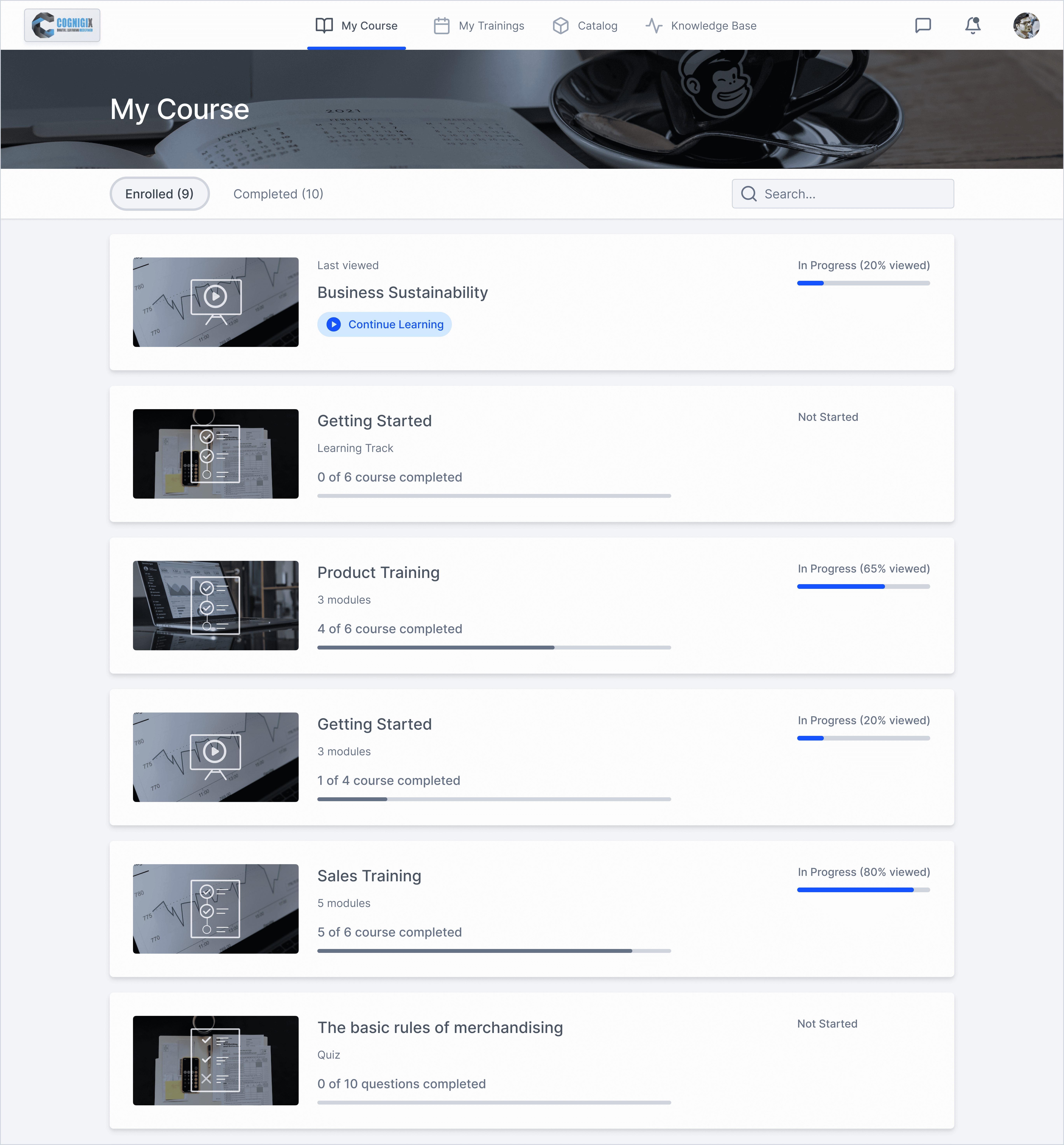
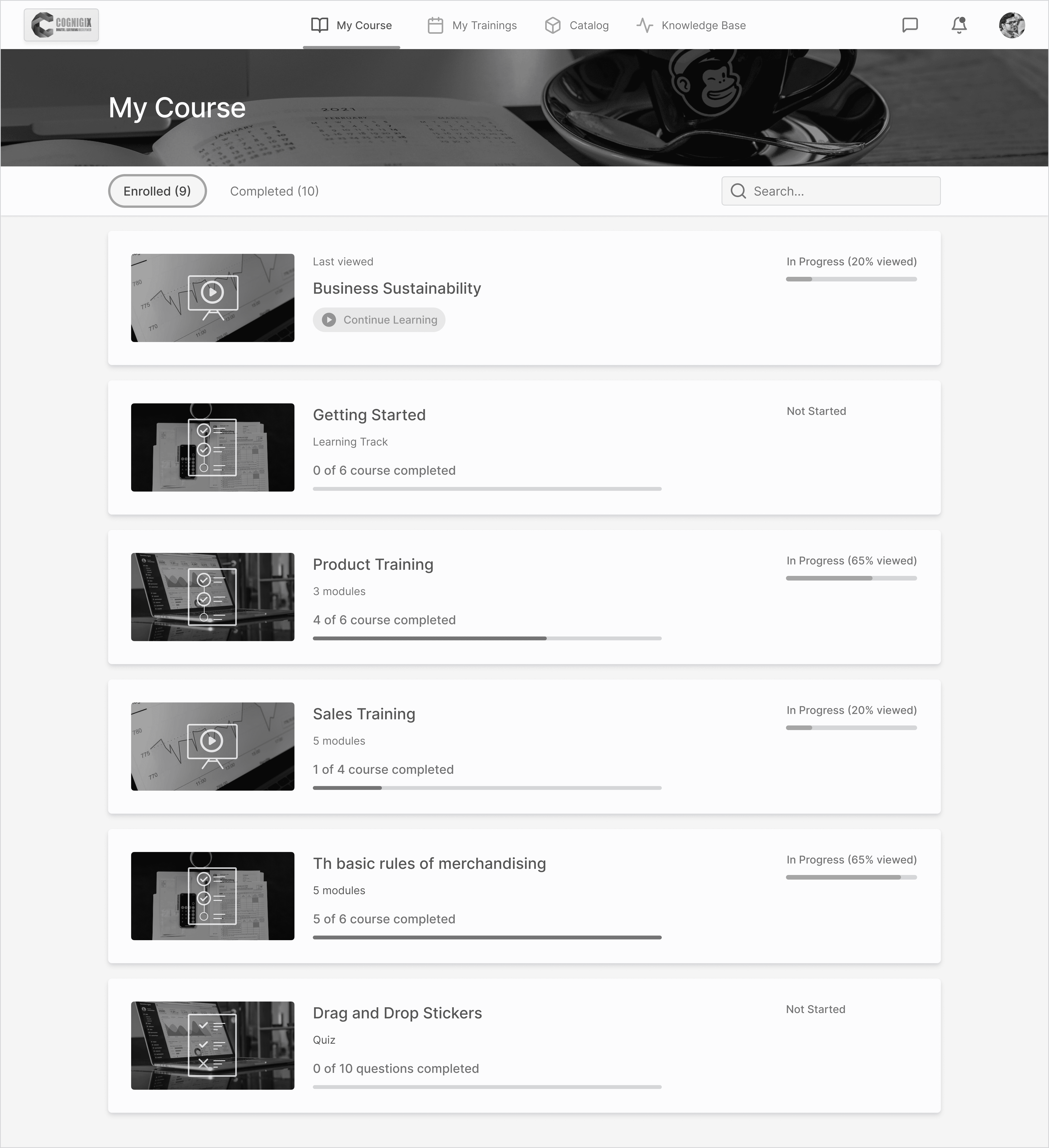
My Course
My Course
Learning History consist of content view status along with score & duration.
Used table format to represent data.
Used different color codes to represent course journey status.
Used different icons to represent content types as: Quiz, Text, Video etc.
Learning History consist of content view status along with score & duration.
Used table format to represent data.
Used different color codes to represent course journey status.
Used different icons to represent content types as: Quiz, Text, Video etc.
This 4 variables have 2 states either fixed or flexible ex: fixed time, flexible duration vice-versa.
This 4 variables have 2 states either fixed or flexible ex: fixed time, flexible duration vice-versa.
When the administrator enrolls users into a course, the course appears under the Enrolled tab of the My Courses section of the User Portal.
When the administrator enrolls users into a course, the course appears under the Enrolled tab of the My Courses section of the User Portal.
Sorting
Sorting
In the User Portal, courses and learning tracks are sorted as follows:
In the User Portal, courses and learning tracks are sorted as follows:
First, the course that the user viewed most recently.
First, the course that the user viewed most recently.
And last, courses from the Catalog that students added themselves.
And last, courses from the Catalog that students added themselves.
Then, the courses assigned by the instructor.
Then, the courses assigned by the instructor.
Search
Search
To search a course by the title, description, or tags, use the search bar at the top right corner of the My Courses page. Start typing text and the system will leave matching items on the page.
To search a course by the title, description, or tags, use the search bar at the top right corner of the My Courses page. Start typing text and the system will leave matching items on the page.
Color Independent Access
Color Independent Access
Here UI is shown in Greyscale, a view that user from color blindness has.
Here UI is shown in Greyscale, a view that user from color blindness has.
In order to make UI accessible color contrast is given priority, along with giving meaningful affordance to information-bearing elements, UI controls, decorative & disabled elements.
In order to make UI accessible color contrast is given priority, along with giving meaningful affordance to information-bearing elements, UI controls, decorative & disabled elements.
For example outline stroke to Enrolled-tab, using high contrast color for progress indicator, using an active bar at the bottom of navigation-tabs.
For example outline stroke to Enrolled-tab, using high contrast color for progress indicator, using an active bar at the bottom of navigation-tabs.
Key Findings
Key Findings
It was really interesting to reflect on the vast amount of variables and design considerations that need to be made even in common user experiences like filling out a form.
It was really interesting to reflect on the vast amount of variables and design considerations that need to be made even in common user experiences like filling out a form.
Keeping the Team & Client Posted
Keeping the Team & Client Posted
Being able to present my progress regularly during our meetings allowed the entire team to be in the same loop; and concerns could be raised earlier.
Being able to present my progress regularly during our meetings allowed the entire team to be in the same loop; and concerns could be raised earlier.
Collaboration with PM
Collaboration with PM
By actively listening to each other’s ideas, PM and I were able to work together seamlessly and efficiently to ensure we were on schedule.
By actively listening to each other’s ideas, PM and I were able to work together seamlessly and efficiently to ensure we were on schedule.
Lessons Learned:
Lessons Learned:
Best Practice ≠ Best Solution
Best Practice ≠ Best Solution
Choosing between a single vs. multi-page form taught me that design-thinking is contexually-based on target users and their desired objectives.
Choosing between a single vs. multi-page form taught me that design-thinking is contexually-based on target users and their desired objectives.
Ask Questions!
Ask Questions!
Speaking up and asking questions & clear any possible assumptions.
Speaking up and asking questions & clear any possible assumptions.
To document your daily decisions of projects you are working on, this will help us to know on what context & problem type we made decisions that not might sound reasonable or even logical in future.
To document your daily decisions of projects you are working on, this will help us to know on what context & problem type we made decisions that not might sound reasonable or even logical in future.
What I could've done better:
What I could've done better:
Push for User Testing
Push for User Testing
Although this was an internal client project on a short timeline, user testing would have been extremely beneficial in supporting our design hypotheses.
Although this was an internal client project on a short timeline, user testing would have been extremely beneficial in supporting our design hypotheses.